Build a small brand kit without a software subscription
A practical colour, typography and mockup workflow for a first brand direction, with licensing decisions made early.
A compact brand-direction document with a palette, type hierarchy and two example applications.
A small brand kit should make the next design decision easier. It does not need twenty colours or a folder full of unrelated mockups. This workflow is for exploring an initial direction. A finished identity may require original mark design, production testing and a more detailed handover.
Free boundaries before you start
Source checks for this workflow. These notes clarify older catalogue summaries; they do not change your saved toolkit.
Coolors · not verified 2026-10-13
Current official plan could not be retrieved. Existing catalogue wording is not a fresh verification; check the provider before relying on a limit.
Account requirement not confirmed in this source check.
Google Fonts · checked 2026-10-13
Download fonts from the public Google Fonts repository and self-host under each font family licence; no paid subscription required. Mostly SIL OFL 1.1; some Apache 2.0 or Ubuntu Font Licence 1.0. Check each family; modified fonts may have reserved-name requirements.
No account required for the described local use or download.
Photopea · checked 2026-10-13
Core local browser editor remains free and ad-supported; PSD and common image formats supported. Premium removes advertising. No numeric AI-credit or cloud-storage quota was confirmed in this check. No open-source licence was established; fonts and imported assets retain their own rights.
Account requirement not confirmed in this source check.
A small example to aim for
Good things, grown slowly.
FreeStack example output · illustrative, not a provider screenshot or a tested export.
Jump to a step
Choose a clear creative constraint
Write three qualities the brand should communicate and one quality it should avoid. Add the audience and where they will meet the brand first. A local food brand and a developer tool may both want to look confident, but their examples, tone and visual references should be different. Use the brief to judge choices rather than personal taste alone.
Give each colour a job
Explore palette options with Coolors, then choose a main colour, a supporting colour and a small set of neutrals. Place them into a real heading, button and paragraph. Check contrast with an appropriate contrast checker before finalising text combinations. A palette that looks attractive as equal swatches can behave very differently across a page.
Test typography with real words
Shortlist a small number of families from Google Fonts. Set the actual brand name, a long heading and a paragraph of realistic copy. Check the characters and weights the project needs. Save the licence alongside the font files. If a family only looks good with the specimen text, it is not yet a reliable choice.
Make two useful applications
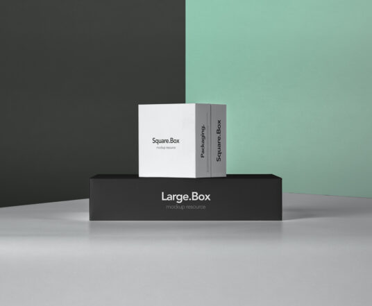
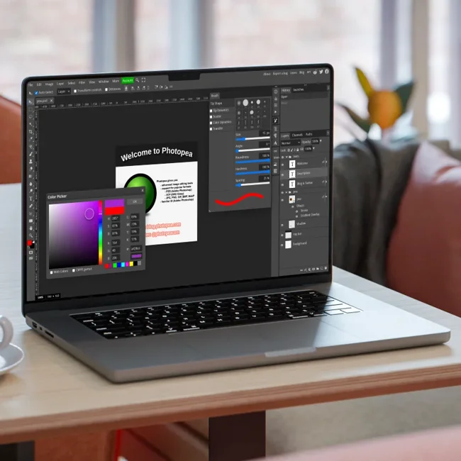
Create a simple social tile or website-header direction, then present it in an appropriate mockup. Photopea is a candidate for layered image editing, while Mockup World helps find mockup resources. Confirm the specific file works in your editor before building the whole presentation around it. Keep the presentation honest: an image mockup does not demonstrate print quality.
Package the decisions
Create a short handover showing colour values, type sizes, approved combinations and the two applications. Include asset sources and licences. Add one example of what to avoid, such as low-contrast text or an unapproved font combination. The useful deliverable is a repeatable set of decisions, not just a stylish cover page.
Your workflow, connected.
Follow the steps and carry the output into the next stage. These are suggested handoffs, not automatic integrations.
Provider information
Check current plans and documentation before committing to a workflow.
View 3 provider links
A couple of useful questions
Can this produce a complete logo?
This is a brand-direction workflow. Original logo creation and production-ready vector files may require a separate design process and suitable tools.
How many fonts should I start with?
One versatile family can be enough. Add a second only when it has a clear role that the first family cannot fulfil.
What would you try?
Share your result or ask a specific question about this workflow.
Join the conversationKeep building
 Photopea
Cut out a product photo without adding another subscription
A manual Photopea workflow for a clean transparent PNG, with an edge check before you publish.
Photopea The League of Moveable Type
Make a small digital zine with a free creative stack
Move from a loose theme to a readable miniature publication using original illustrations, considered type and a simple layout.